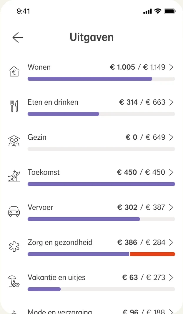
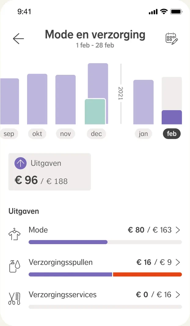
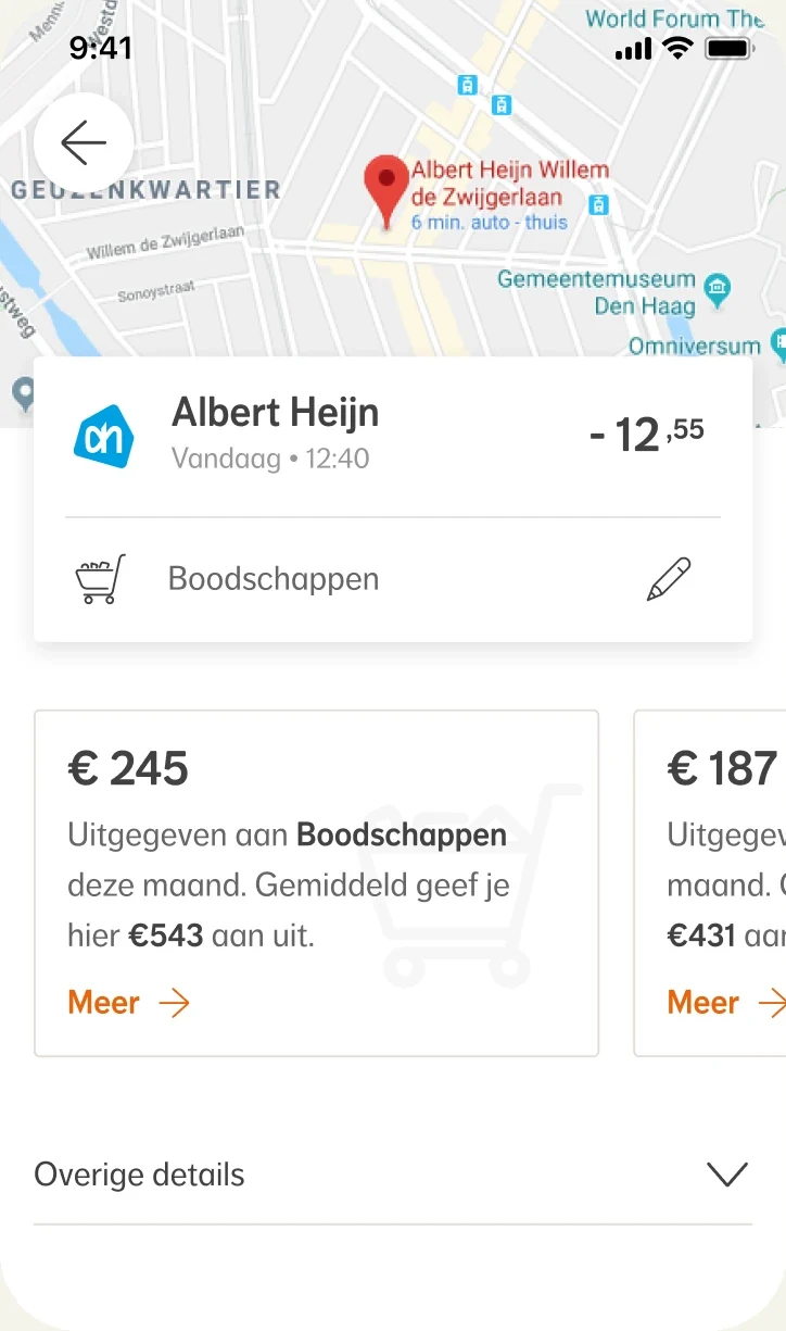
Say you’re standing in the supermarket. If your budget is doing well this month, it can be steak today. If your money is going too fast, it’ll be mince. That was the trade-off we wanted to help people with, so they can make better choices more easily.
Is a day at a theme park a holiday?
In early 2020 I joined a team that had been doing proposition research. The new goal was to get a first version live, and that’s what I was brought in for.
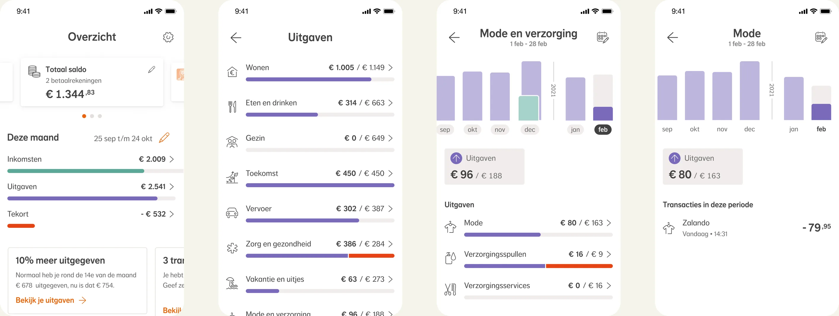
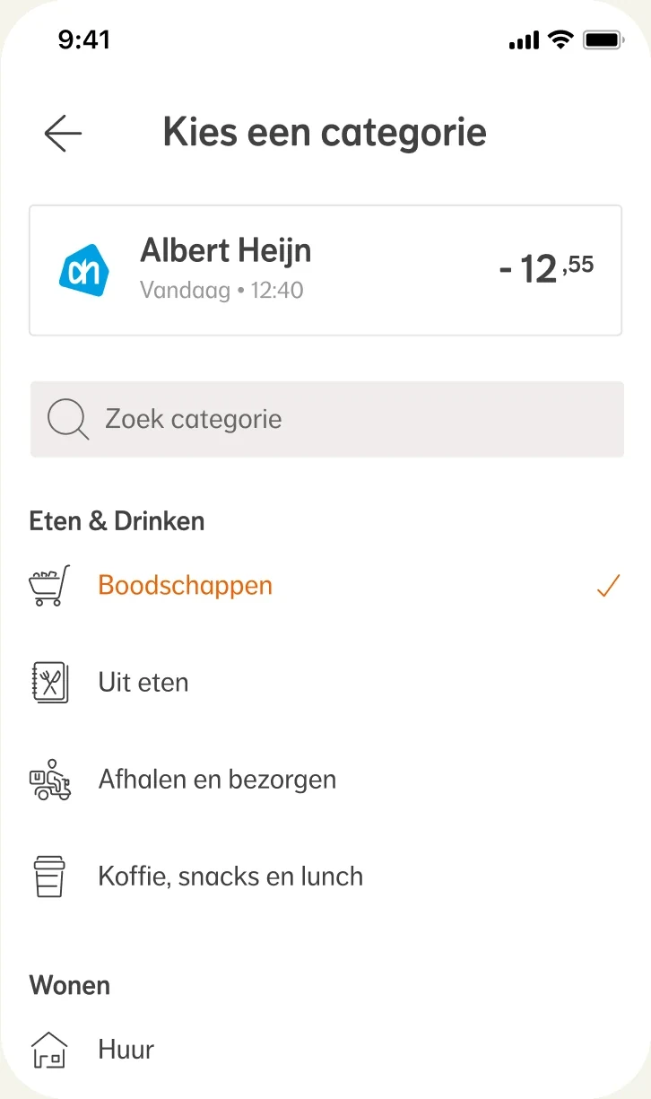
Transactions came into the app with around 150 categories. For a computer system that works fine. For someone who wants to know where her money goes, it’s far too fine-grained. It had to be simpler.
But where do you draw the line? Do Restaurants and Groceries go under Food & Drink, or do they each deserve their own category? Does a day at a theme park go under Holidays? You can weigh up questions like these at your desk and hope the answers hold up in practice. Only, a category model is hard to change once it’s rolled out. It had to be based on how people see things from the very start.
Card sorting research in 24 hours
User research is often seen as difficult, expensive and slow. I wanted to show that it can also be easy, cheap and fast. On crowdsourcing platforms people do all kinds of tasks, from moderating photos to processing Excel data, and so user research too. I tried Amazon MTurk, Clickworker, UsabilityHub and Prolific. Prolific came out best: it quickly delivers a large group of Dutch respondents, the answers are well considered and the price is far below that of a research agency.
Through Prolific we had 200 people group the categories in a card sorting experiment. Within 24 hours we had the results. From the tree diagram we could distil 12 clear groups. We had our category model!

It all revolves around money streams
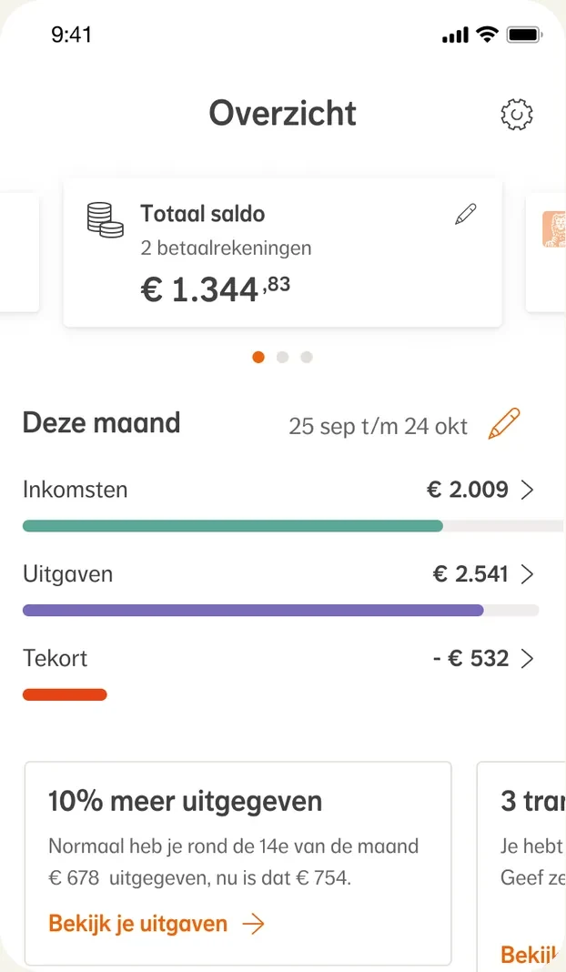
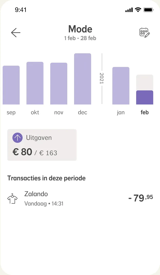
On that model I built the money streams: the flows of your income and spending. With them, a user could zoom in from a bird’s-eye view to a very detailed picture of her finances. Earlier we had taken a wrong step by showing money streams one moment and a balance the next. By building the whole app around money streams, we gave users the most transparent insight.
A design system from scratch
The designer I worked with in the team took the initiative to set up a design system straight away, alongside the app. Ours was the first project within NN in Figma, and that gave us the chance to build something from scratch. He had been at NN for a while and noticed that the design system of the time, in Sketch, wasn’t made for a banking app. A financial app calls for more dynamic components and a richer colour palette, so you can shape information well and take people by the hand.
We presented our work every month to the design guild, branding manager and tech leads. Our initiative was seen and recognised: after a few months a dedicated design system team was set up.
I contributed outside the app as well. Early on, I helped shape the team’s way of working by sharing my experience with agile and helping to put its basic principles in place. And when Bank was about to become part of the general NN app, I organised co-design sessions with designers from Bank and Retail to arrive at a single navigation together.
A fully furnished house
I left in April 2021. A few weeks later a lovely compliment landed in my inbox: the designer who had taken over from me said it felt like “moving into a fully furnished house”.
In May 2026 NN launched the app. It was nice to see how recognisable it still is from how I left it back then.
Don’t hold a meeting about it, research it!
It’s tempting to hold long and numerous meetings about something like a category model. I’m glad we took a different approach in this project. Instead of meeting, we found the answer by involving the public. That got us a better model than we could have come up with at our desks.